dlaprzemyslu.pl: visual identity for the industrial sector
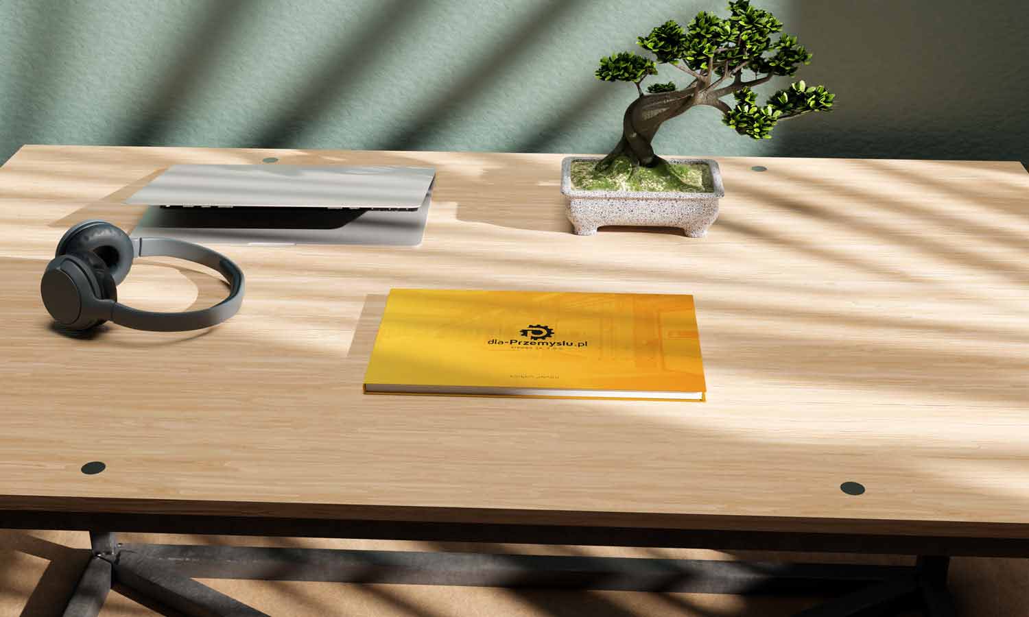
We designed a full visual identity system for dlaprzemyslu.pl Sikora. We created a modern logo that combines a gear motif with the letter P, along with complete brand guidelines. Our work covered logo design, branding and a consistent brand image, tailored to the manufacturing, engineering and workplace safety sector.
Services
Logo, branding and brand image
Category
Visual identity
Client
dlaprzemyslu.pl

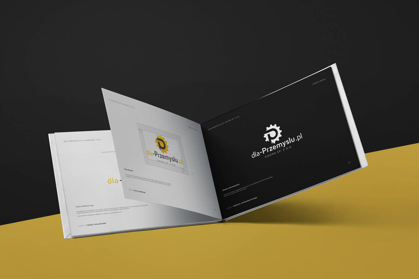
The challenge in the engineering and manufacturing sector
A company supplying equipment for warehouses, construction sites and the safety sector needed a strong brand image that builds trust among professionals. Our task was to create a visual identity that highlights technical stability, precision and the highest standards in industry.
Result
IMAGE
The dlaprzemyslu.pl brand gained a highly professional look. Comprehensive branding makes it easier to build long term relationships in the B2B sector and clearly sets the company apart from its competitors in the technical field.
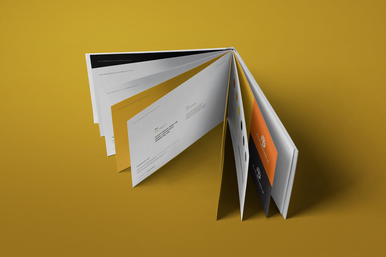
Colour palette
The colour scheme is based on a combination of energetic orange and yellow, referring directly to the safety sector. It is all balanced by a strong, stable shade of grey that builds technical authority.
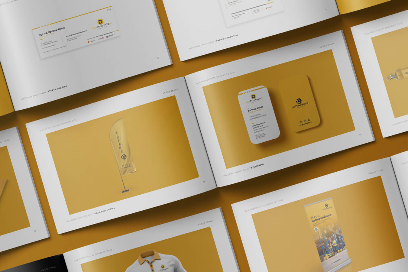
Consistent brand materials
We prepared a very extensive brand book that defines every communication medium. We designed business cards, folders, letterhead, workwear and professional vehicle wraps, among others. As a result, the brand builds a consistent experience at every stage of contact with the business client.
Iconography and an authentic message
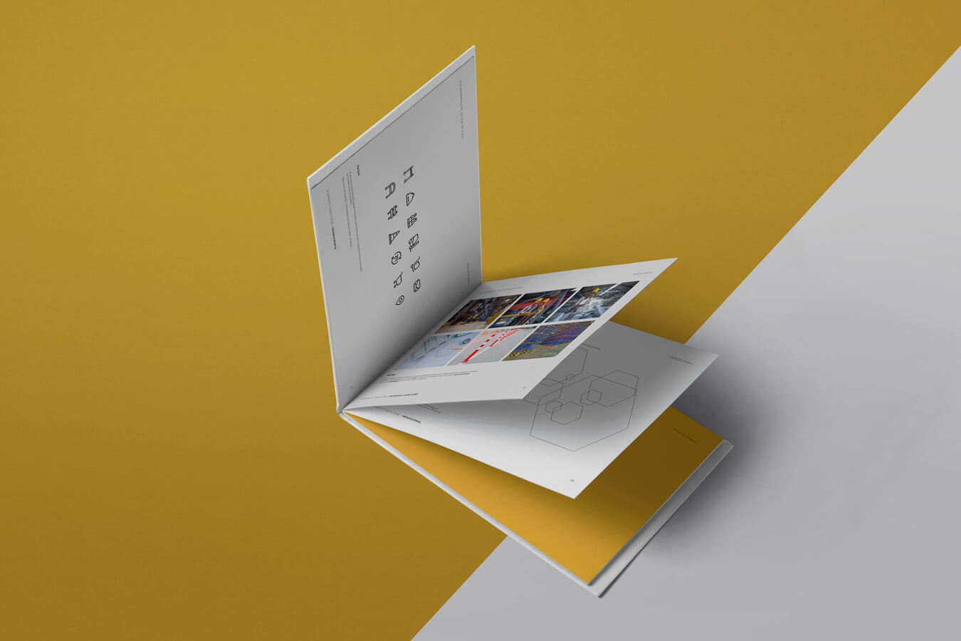
The whole system is completed by a dedicated icon style based on linear forms and rounded shapes. We also defined photography guidelines, focusing on authentic photos of people at work, technical drawings and details of finished products. This reinforces the image of an expert in the eyes of engineers.
See other work

Your brand could be next.
You have just seen how we turn business challenges into a working digital product. We do not copy solutions, we choose the tools for the specific goal. If you are looking for a partner who can deliver similar quality for your company, let us talk details.